Who guessed long-term Treasuries would be the best asset class to own? That 2014 would be the year of the REIT? Or Utilities, the most boring sector ever, would sit on top of the S&P. If anything, last year’s end results prove again – you’re better off with a long-term perspective because trying to predict the next six to twelve months is down right hard. And tweaking your portfolio because of short-term predictions can get messy.
Had you guessed, and acted on, 2014 being the year of falling interest rates, a stronger dollar, crashing oil, and geopolitical risks, then you had a great year. Had you guessed wrong, it could look terrible.
But if you stuck with a diverse portfolio you had another decent year. The good thing about decent years – they’re never great or terrible but they add up over time.
Which brings us to the charts – updated with the full year results through 2014 (with dividends included).
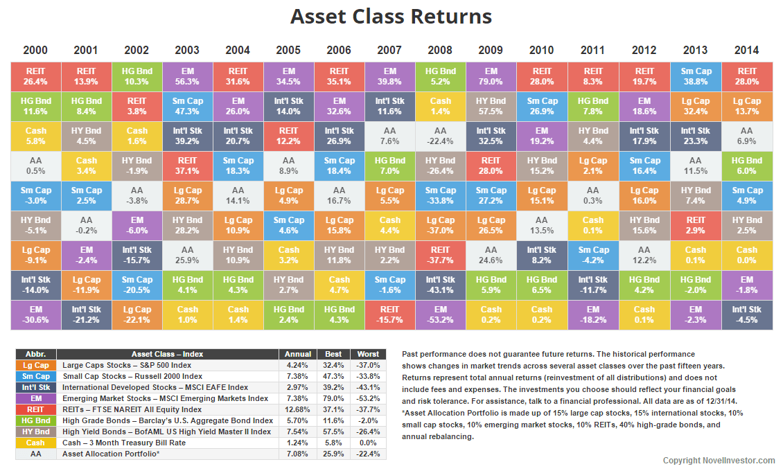
Click for the full size chart.
REITs are the clear winner for 2014 and the past 15 years. The S&P 500 finished up 13.7% with three years of double-digit returns and six straight positive years. Yet, since 2000 the S&P is well below its historical average. The same is true for international stocks.
The annual returns for both the S&P and international stocks will naturally rise as the losses from 2000 to 2002 drop off over the next three years. Positive returns in the next three years will hasten the process.
Both international and emerging markets performed worse than cash last year. Both dragged down the diversified portfolio. Times like these are when investors start asking questions like why don’t I own more US stocks or REITs? The chart is the perfect reason why. Nothing lasts forever.

Click for the full size chart.
Let’s face it, things are good in the U.S. QE ended. The economy is growing. Unemployment is down. Inflation is low. Gas is cheap. There was a faint sign of wage growth. And the markets are doing great.
The utilities sector killed it in 2014. Who would have guessed? I wonder how much of that was chasing dividend yield? Still, utilities are the second best performing sector since 2003, behind energy. Financials are the worst.
In the past six years only four sectors have finished the year negative. Three – industrials, materials, and financials – in 2011 and energy crashed in 2014. You’ll see later, energy was up 13% in the first half of 2014, only to fall 20% in the last six months thanks to the collapse in oil prices.
On a side note, without 2000 to 2002 dragging things down, the S&P returns look good. None of it affects your money, but it shows how different things can look when you cherry pick years. In this case, it wasn’t intentional. I only have data back to 2003.
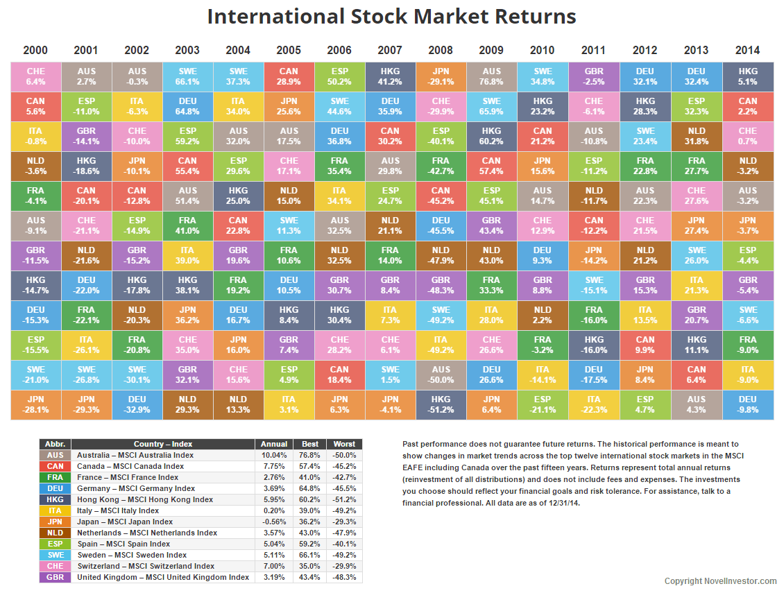
Click for the full size chart.
Crashing oil, and a strong dollar, dragged down international markets in 2014. Of all the places cheap oil should help is in Europe where gas prices are ridiculously high. A stronger dollar had a bigger impact on international returns. Simply, a strong dollar is great for tourists exchanging for Euros, but less so when investing overseas.
The past fifteen years have not been kind to international markets. The dotcom crash, the financial crisis, then the Euro debt crisis popping up every other year has wiped out annual returns for most European countries. Even with a diversified international fund, you’re getting a wide range of returns across countries.
Of course, the chart doesn’t show every country. I stuck a table at the bottom of this post with the 2014 returns for all 22 developed countries. Half of the countries finished positive for the year. Only one, Israel, beat the US.
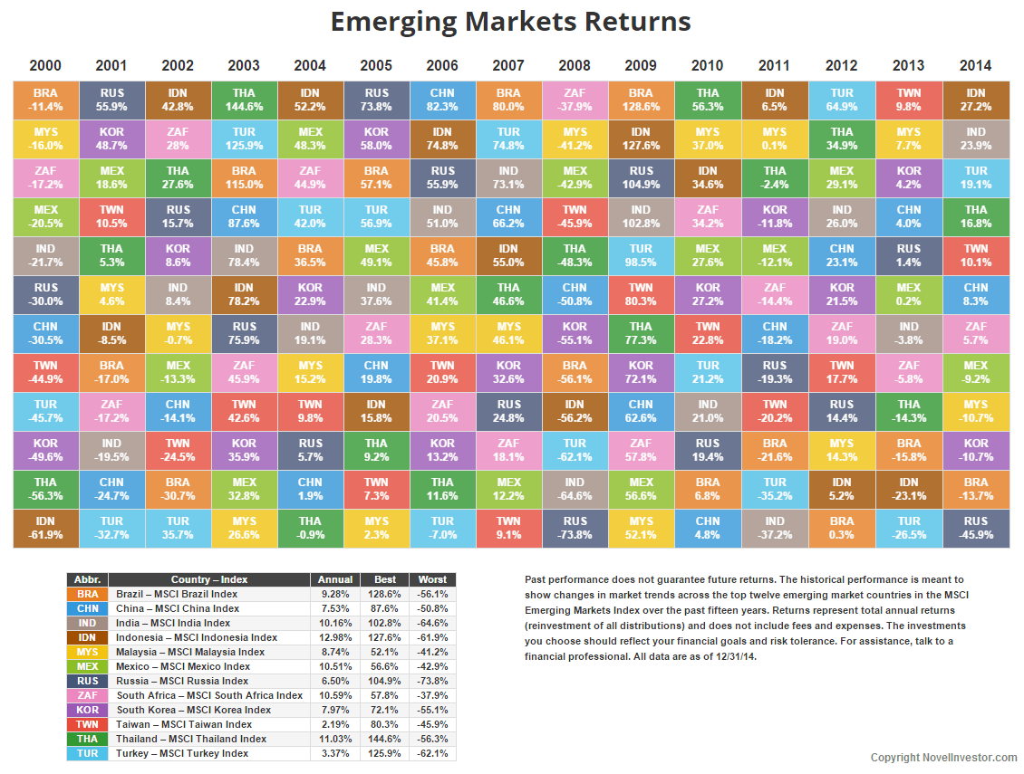
Click for the full size chart.
Emerging markets were the second worst performer for 2014. No surprise there. Russia’s pitiful performance dragged things down. I put a table below with all the emerging market countries, which shows it wasn’t only Russia – 12 of the 23 countries finished in the red.
Unlike the developed countries, emerging markets have done well the last fifteen years. Only recently, the past four years, we’ve seen some reversion. Pundits have called emerging markets cheap for several years now.
Keep in mind emerging markets don’t move as one. Each country is at a different point in its own market cycle. An investor who can stomach higher volatility might look at the worst performers in the past three to five years.
How Quickly Things Change
The one constant in financial markets is change. Six months ago these charts looked very different.
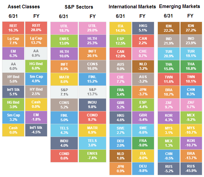 Who predicted how different these returns would look only six months later?
- REITs added another 12% while International stocks dropped almost 10%. How will interest rate changes affect REITs, bonds, and dividend stocks going forward?
- Energy sector crashed 20% while Utilities, Healthcare, Tech, Financials, and Consumer Staples added at least 10%.
- The collapse in oil prices offers two extreme views – it’s a huge benefit to the global economy and the greatest investment opportunity in decades or we just saw the peak in global oil demand with the potential collapse of countries and companies reliant on high-priced oil. I’ll let you decide.
- Outside of the US, China was the only country to show significant gains in the past six months. Momentum or something else?
- 7 of the 12 listed developed countries dropped 10% or more in six months. How long will the strong dollar last?
- Hong Kong was the only developed country to end the year higher, barely.
- Russia is proof that things often get worse before they get better. Contrarian play or too much political risk?
With all the factors affecting markets, it’s a reminder of how quickly things can change. Sometimes the best recourse is to sit back, relax, and do nothing.
2014 Developed Markets Performance
| Country | 2014 Return |
| Israel | 23.7% |
| USA | 13.7% |
| New Zealand | 8.2% |
| Denmark | 6.8% |
| Hong Kong | 5.1% |
| Belgium | 4.9% |
| Singapore | 3.1% |
| Ireland | 2.6% |
| Canada | 2.2% |
| Finland | 0.8% |
| Switzerland | 0.7% |
| Netherlands | -3.2% |
| Australia | -3.2% |
| Japan | -3.7% |
| Spain | -4.4% |
| Great Britain | -5.4% |
| Sweden | -6.6% |
| France | -9.0% |
| Italy | -9.0% |
| Germany | -9.8% |
| Norway | -21.2% |
| Austria | -29.4% |
| Portugal | -37.7% |
*USA is the S&P 500 all others are the MSCI index for the country
2014 Emerging Markets Performance
| Country | 2014 Return |
| Egypt | 29.4% |
| Indonesia | 27.2% |
| Philippines | 26.4% |
| India | 23.9% |
| Turkey | 19.1% |
| Thailand | 16.8% |
| Qatar | 16.6% |
| UAE | 13.7% |
| Peru | 10.5% |
| Taiwan | 10.1% |
| China | 8.3% |
| South Africa | 5.7% |
| Czech Republic | -2.4% |
| Mexico | -9.2% |
| Malaysia | -10.7% |
| South Korea | -10.7% |
| Chile | -12.2% |
| Poland | -13.6% |
| Brazil | -13.7% |
| Colombia | -19.8% |
| Hungary | -27.4% |
| Greece | -39.9% |
| Russia | -45.9% |
