I update the asset class, sector, and country returns twice a year – at the half way point and year end. The end of June means it’s time for an update. But before I get into the actual results I want to point out a few things to take notice of beyond the numbers.
The charts are a simple visual tool that helps to explain a few simple concepts like how returns change from one year to next, how a diversified portfolio gives up the best returns in order to never get the worst returns, and how so many investors fall victim to chasing the past.
But the charts also show how assets achieve an average return yet always seem to fall above or below that average every year (meaning the assets never hit their average return in any year), why assets produce returns that tend to revert back to the average over longer periods, and why valuations matter.
Simply, you never see one asset class, sector, or country always on top of the chart or always on the bottom every single year.
Last of all, the charts show how annual returns can look very different from one 15 year slice to the next. Fifteen years is a small snapshot in time and shouldn’t be projected as the complete history of returns from the distant past to the far off future. Yet, many investors make that mistake when seeing past performance.
If you use these tables for anything, use them for what they are – a guide showing that things are always changing, most often when you least expect it, and at the moment you’re most certain it won’t.
Below you’ll find tables for asset class, S&P sector, international market, and emerging market returns, along with a link to the full-size interactive chart for each. I won’t spend much time discussing the actual results since, well, the results obvious.
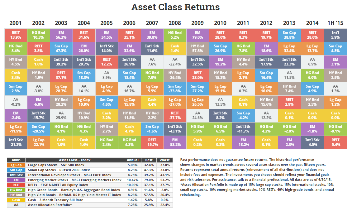
Click for the interactive asset class chart.
In setting up the charts, I had to lop off the 2000 stats to make way for 2015. The charts only show the past 15 years because I figured it was a long enough period to get a sense of the concepts discussed earlier and more years made it harder to read.
It’s not obvious unless you compare it to the charts ending in 2014 but cutting out 2000 shows how much of an impact one year can have on long-term annual returns.
For instance, annual returns for emerging markets rose about 3% since it had the worst returns in 2000. REITs, on the other hand, lost 2.5% from its annual return thanks to dropping its great return in 2000 and its current loss in 2015.
When you put it together, it shows how one big loss or gain can have a dramatic impact on years of performance. But it also shows how easy it is to manipulate returns over what seem like many years, but are only a sliver of the past.
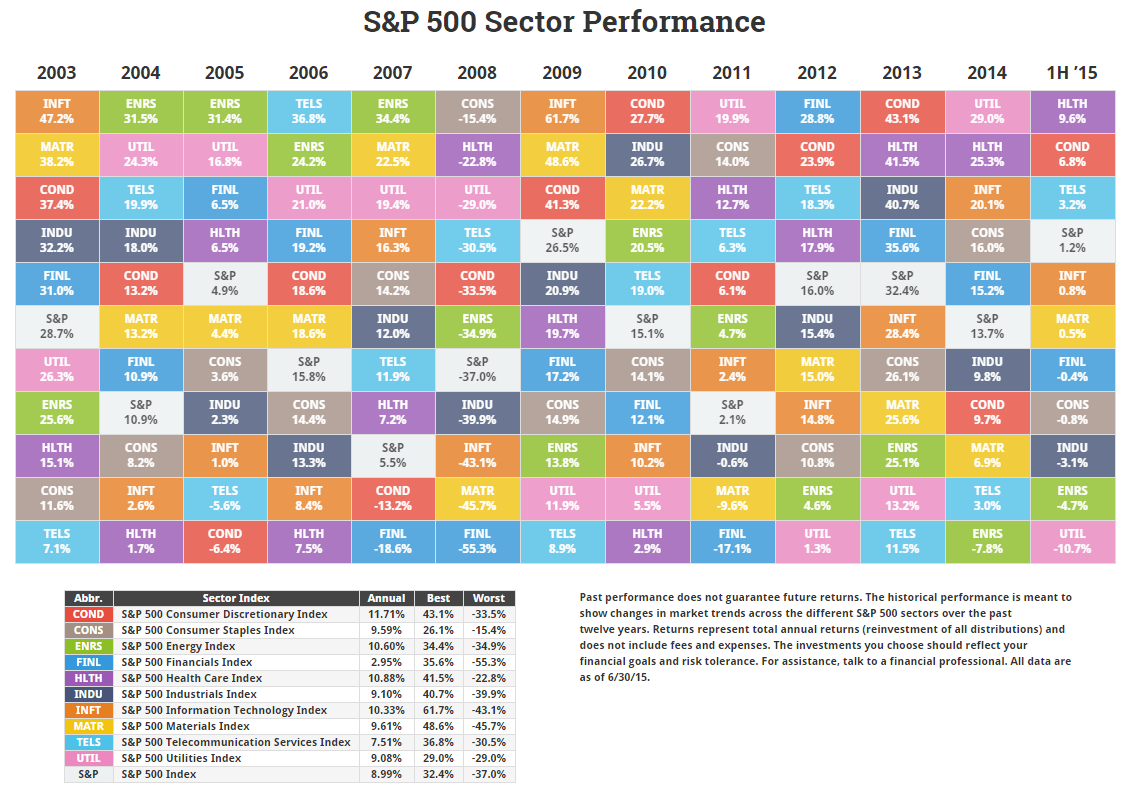
Click for the interactive sector chart.
The S&P 500 hasn’t done anything this year. Really, you shouldn’t expect it after the performance its had since 2009. The S&P being up or down doesn’t really tell the whole story anyway.
Breaking down the market into sectors gives you an idea where the returns are coming from. As the market moves through cycles, knowing how each sector performs should give you an idea of where we stand in the current cycle.
I’ll offer one point on utilities being the worst performer so far this year. Dividend stocks became a favored investment thanks to low interest rates. Now that the Fed is talking higher rates, people get worked up, and you get a selloff in a sector known for dividends. Whether this is a sign of more to come, who knows.
For anyone worried about a loss from their dividend stocks, I’d recommend you remind yourself why you bought the stock in the first. Investors tend to see a loss and forget why they originally bought an investment like for the regular dividend payments not the capital gains. Besides, a cheaper dividend stock should offer a better yield if you buy more at the lower price.
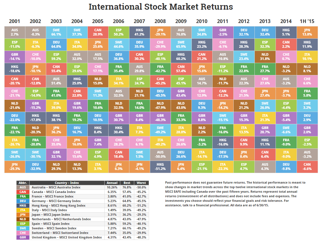
Click for the interactive international chart.
The international markets took a back seat to the U.S. the last few years. The roles seem to be reversed so far this year.
Most of that performance is coming from European countries. The chart doesn’t do it justice since it’s cut down to the twelve largest countries but over half of the developed markets produced better than 6% returns over the last six months including Ireland, Norway, Belgium, Israel, Austria, Denmark, and Portugal along with those shown above.

Click for the emerging markets chart.
A lot can change in a few months with emerging markets. Last year’s best and worst performers, India and Russia, flip-flopped after six months. Russia was the most undervalued market by CAPE ratio to start the year. Anyone not scared off by a 45% loss did very well for six months.
The most deceptive number in the chart is China. The Chinese market has been in a free fall since mid-June to today and doesn’t show any sign of stopping soon. If you want to learn about investor behavior during booms and busts, the Chinese stock market is the perfect case study.
Which brings me to my last point. While these charts do a good job of explaining several key concepts, they don’t tell the full story of what drives returns from one year to the next. The charts only show the results when all the factors collide.