Certain pockets of the market tend to outperform others. The classic value metrics like price-to-earnings or price-to-book were the first to be discovered back in Ben Graham’s era. Since then numerous value metrics have shown better results (we’ll get to those at later date).
Value metrics work in the long run mainly because of mean reversion and a side of behavioral bias. Investors tend to place bets based on popularity and recency bias. As Graham said, “In the short run, the market is a voting machine…”
The thinking goes like this. Companies doing well will continue to do well and companies doing poorly will continue to do poorly and nothing will change that. This works for a while until mean reversion steps in. Mean reversion is the tendency for fundamentals and stock prices to revert to a long-run average thanks to competition.
Excellent companies, with high-profit margins and growth rates, that make a ton of money, get priced with that mind but they also attract competition. That competition puts pressure on profit margins, growth rates, etc. which feeds into P/E ratios, stock prices, and more. In other words, the excellent company becomes an average company and markets eventually adjust its stock price to that reality.
Mean reversion also happens on the opposite end. Poor companies don’t stay poor. Competitors leave industries, they close up shop, or consolidate. Earnings and profit margins improve. The poor company becomes average.
Simply put, “excellent” companies tend to underperform and “poor” companies tend to outperform the market. There are exceptions of course. A rare number of companies tend to stay excellent for an exceptionally long time. Some poor companies will stay poor. But the large majority of companies are impacted by mean reversion. So it’s not a question of if, but when.
With the recent resurrection of “value,” I thought it’d be fun to see how some of the classic value metrics — with a few updated versions of them — performed this century. Backtests were run based on the following assumptions:
- No OTC stocks or ADRs
- No stocks trading below $1/share
- No low volume stocks
- Market cap greater than $50 million
- Deciles are equal-weighted, as is the universe.
- Benchmarked against the Russel 3000 total return index (cap-weighted benchmark is not ideal, so the universe of qualifying stocks is included and probably a better comparison).
- Stocks are bought on January 1st of each year, held for one year, then sold. Rolling backtests are done at four-week intervals with the same holding period.
- Assume all metrics are based on trailing twelve months (TTM).
- Data is from 2000 to 2020, sourced from Portfolio123 (that’s as far back as it goes). Two decades is not a long time, but it’s a starting point for further research.
- Click the tables below for easier reading.
There are two ways to approach the metrics below. One is to focus on the cheapest — the lowest decile. Note that many of the metrics below show the lowest decile performs worse than the second-lowest. It’s a reminder that any value metric is a starting point, not an endpoint. Some companies are cheap for a reason. In fact, Ben Graham’s strategies purposely used value in combination with other metrics, like low debt-to-equity, to help eliminate the worst companies from consideration — thus improving returns.
The other way to approach value metrics is to invert it. Rather than focus on the lowest decile, eliminate the highest and invest in what’s left.
Price/Book
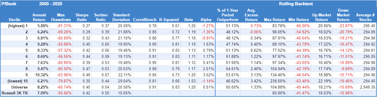 Price to book gets a lot of criticism and rightly so. The lowest decile barely outperformed the highest decile, but both underperformed the universe and the benchmark. It’s a good example of “poor companies tend to stay poor.” It’s especially true, when the next two lowest deciles performed so much better.
Price/Tangible Book
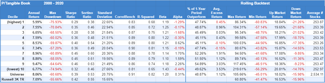 Price to tangible book leaves out intangible assets like patents, trademarks, goodwill, and other non-physical assets. So tangible book applies more to companies sitting on a lot of land, property, equipment, and inventory. The results are similar to price to book.
Price/Earnings including Extraordinary Items
 Extraordinary items is accounting speak for something that impacts earnings but is unrelated to day-to-day business operations. So including extraordinary items can misrepresent a company’s earnings.
Again, lowest beats highest, but the lowest P/E likely has a mix of companies that deserve to be cheap.
Price/Earnings excluding Extraordinary Items
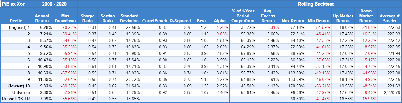 Excluding extraordinary items offers a better sense of what a company earns from day-to-day business. That said, the results show little performance difference between including or excluding extraordinary items with earnings. It might say something about how often extraordinary items show up in the footnotes of financial statements and/or how little the market considers it.
Price/Earnings including R&D
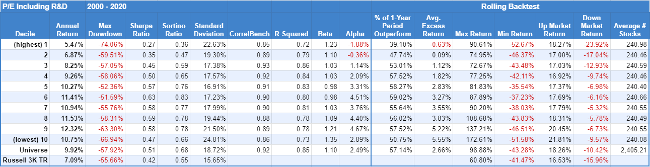 P/E including R&D is also known as the price to innovation adjusted earnings. R&D is often what keeps companies competitive and growing. So a good R&D program is a significant net benefit to a company despite the cost. This metric attempts to adjust earnings with that in mind. It’s most beneficial in industries with high R&D spending.
Like the previous metrics, the lowest decile beats the highest by a significant margin.
Price/Foward Earnings
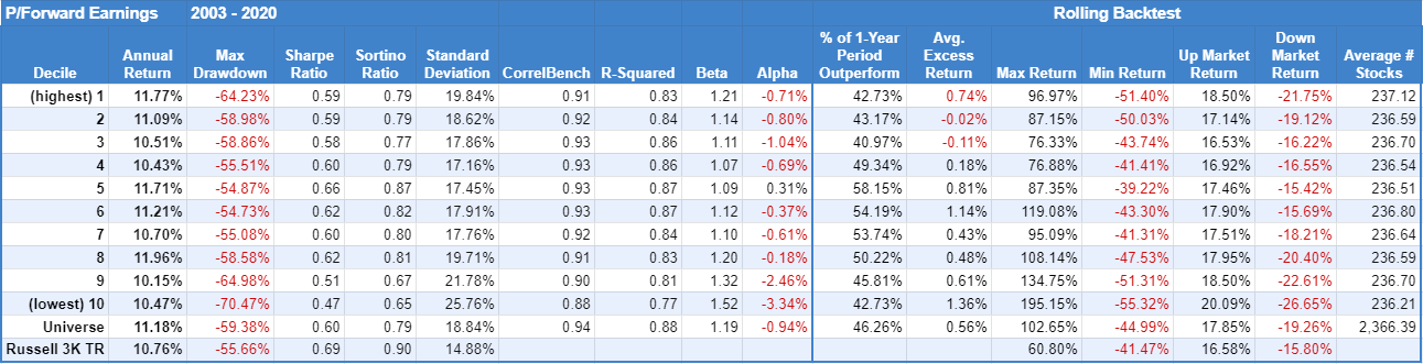 Price to forward earnings uses estimated future earnings. Not surprisingly, the results are mixed…to the point of being unhelpful. Note: the data only goes back to 2003.
Price/Sales
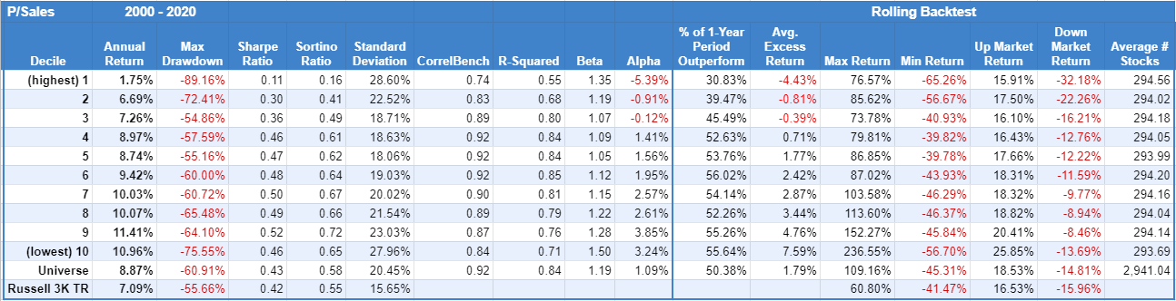 The price to sale ratio is based on the idea the sales fluctuate less than earnings so it offers a better measure of a company’s value. Sales are also harder to manipulate too.
Again, the lowest decile beats the highest, but by the widest margin of all the metrics above.
Related Reading:
The Price of Excellence
Defying Reversion to the Mean