Tables comparing investment returns are nothing new. Fund companies and other financial institutions have used them for years to argue for or against different investing ideas. Though, the problem is most tables are either stuck inside a PDF file or quickly become a giant mess of colored tiles that make it hard to read. I thought I’d take the concept, clean it up, and take it a step further.
The idea started about a month ago with an article about contrarian investing. The article took a contrarian look at past performance across three areas – asset class, sectors, and countries.
I’ve broken down the idea of contrarian investing before. Basically, it takes a beaten down, unpopular idea and turns it into an investment. This investment style is easy to talk about but a hard one to put into practice. Imagine doing the opposite of popular opinion, then imagine doing it with your money. Over the long-term, contrarian investing tends to pay off for those who can stomach it.
At the time, I thought it was a good idea to repeat the process and track the results going forward. There’s an appeal to investing in a basket of beaten down stocks instead of just one. Index funds and the ETF counterparts help this process. The possible returns might be lower, but the comfort level is higher.
Anyways, once I dug up all the data, I realized there was enough to build tables comparing different asset, sector, and country returns and cover some other topics too. The tables help explain a number of investing concepts that investors struggle with every day.
Of course, the tables cover more advanced concepts too, like mean reversion and why value investing works, but I’ll leave that for another day.
Below you’ll find the links to each table with some basic information about each one – asset class, S&P sectors, international countries, and emerging market countries. Tables are available to print or embed on your site.
Asset Class Table
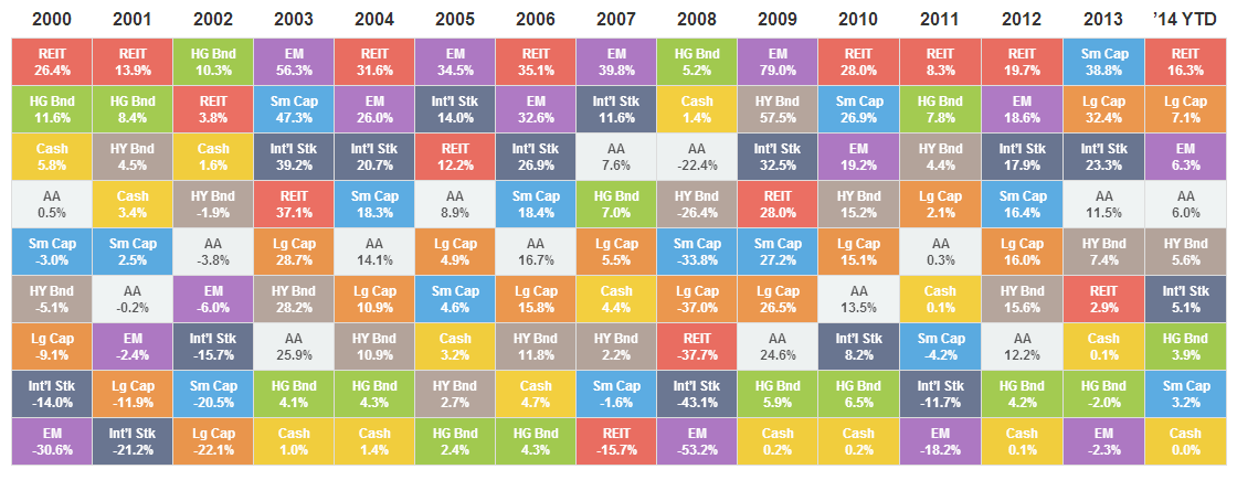
Click for the interactive asset class table.
The idea was to make a table that represented index funds the average investor would own. Most of the asset class tables either cover every asset class possible (with value and growth styles too) or toss in hedge funds, commodities, or other alternatives that most of us should/would never use.
I kept it simple by picking the more common asset classes the average investor would build a portfolio around. For stocks, I used large caps, small caps, international, emerging markets and REITs. The next three tables break down three of those stock asset classes further. For bonds, I stayed with high-grade U.S./corporate bonds and riskier high yield bonds. I added a diversified global portfolio with those assets as a comparison tool.
Sector Table

Click for the interactive S&P sector table.
The best way to show why the U.S. stock market performed the way it did is to break it down by sector. There are ten sectors or broad categories that every stock fits into: Consumer Discretionary, Consumer Staples, Energy, Financials, Health Care, Industrials, Technology, Materials, Telecomm, and Utilities. I added the S&P 500 as a reference.
In any given year, one or more of these sectors can have a big impact on the performance of the U.S. market. For example, you’ll notice how much the financial sector has dragged down the S&P 500 despite the performance of the other sectors.
Country Tables
When you add up all the stock markets of the world, the U.S. market makes up almost half the total market value. International and emerging markets make up the other half. If you only invest in U.S. stock funds, you’re missing out on half of the global investment opportunities. This is even more pronounced for residents of other countries who choose to invest mainly in their home country.
International Developed
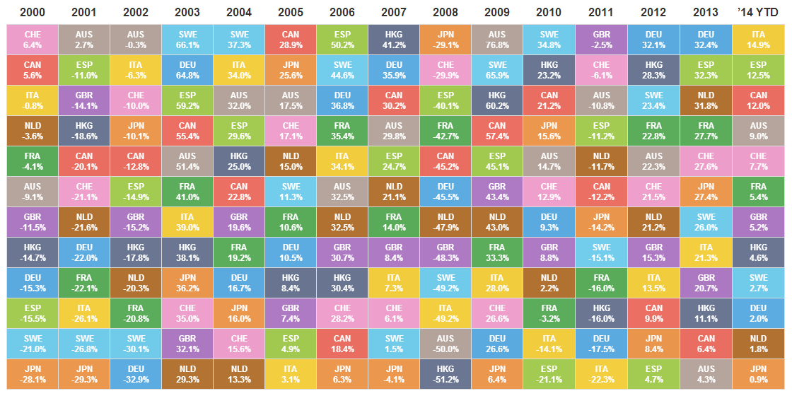
Click for the interactive international markets table.
The template for this table was the MSCI EAFE Index including Canada. In total, that’s 22 countries – too many to build a table around. I weeded out the smallest players based on its standing in the index. The top 12 countries represented in the index are shown in the table. Those countries left out – Austria, Belgium, Denmark, Finland, Ireland, Israel, New Zealand, Norway, Portugal, and Singapore – make up about 9% of the index.
Emerging Markets
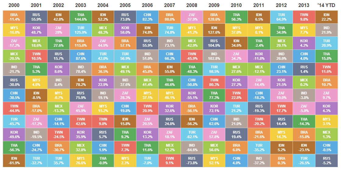
Click for the interactive emerging markets table.
I used the MSCI Emerging Markets Index as a template for this table. The index measures the markets of 23 emerging countries. Again, that’s too many to stuff into one table. Like the international table, I dropped the smallest countries based on its standing in the index. The top 12 emerging markets are represented. The countries left out – Chile, Colombia, Czech Republic, Egypt, Greece, Hungary, Peru, Philippines, Poland, United Arab Emirates, and Qatar – make up about 9% of the index.
Final Thoughts
I’m not entirely convinced that dropping countries is the best way to represent the international and emerging markets. I’m open to alternative suggestions to improve the tables.
The goal is to update these four tables every six months – at the half way point and year-end results. The next update will be early January with 2014’s year-end returns. I’m in the process making images of each table available for other bloggers to use for discussion on their own sites, which I’ll update also.
Finding all the data was a bigger pain than I thought it would be. Transparent wouldn’t describe the process. Financial companies are great at membership walls and other hoops to jump through to get information. There were no giant signs pointing to the index information at any of the relevant sites (the only standout was the FTSE REIT index).
In the future, I’d like to publish the results for all these tables to save the next person some time and headache. With the exception of the sector returns data (for some reason I could only find trustworthy data going back to 2003), most of it goes back several decades.