Markets in 2025 started with a tariff tantrum that recovered and rallied the rest of the year. International markets shrugged off the tantrum quicker, rallied, and outpaced the US by a wide margin.
In addition, there was an AI Bubble, comparisons to the Dotcom Bubble, the return of SPACs, Bitcoin holding companies, private market funds for the masses, single stock levered ETFs, and more. A smorgasbord of speculative investments was introduced this year. Not unlike in 2020 and 2021. It didn’t turn out well then (It was brutal). Will this time be different? Time will tell.
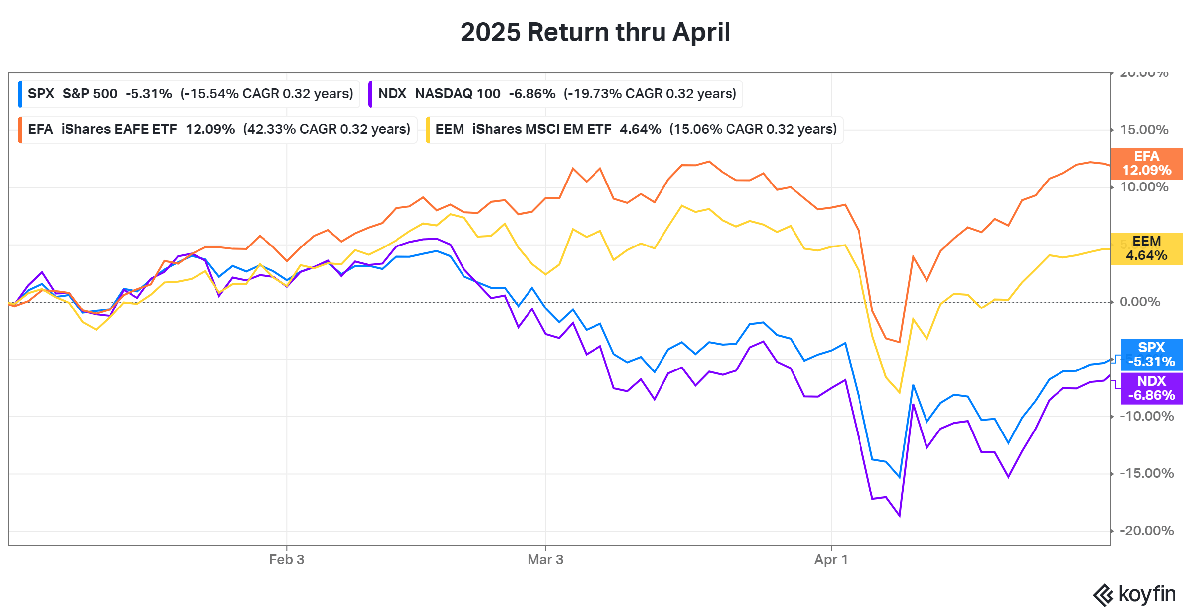
With that, let’s get to the charts. Here’s how things started.
And how it’s ending.
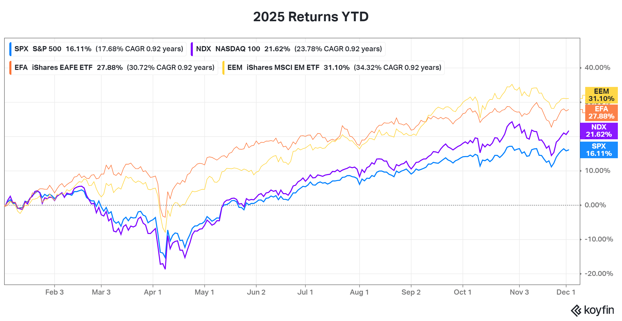
Barring some wild finish, both emerging and international markets will top the S&P 500 this year. That hasn’t happened since 2017.
Digging a little deeper, all major U.S. sectors are positive year to date.

The tech sector is leading, followed closely by communications, and utilities. Real estate and consumer staples hold up the rear.
U.S. Bonds looked good too, by the way. Treasuries across all durations are higher.
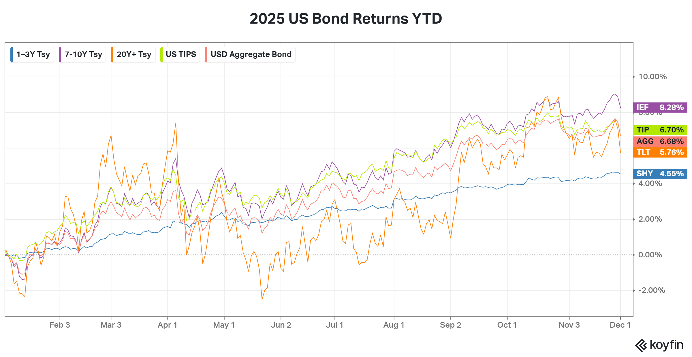
The bump early in the year shows a flight to safety as the stock market dropped. The gradual rise in bond prices since is a result of anticipated and eventual cutting of interest rates.
So, a great year all around for markets considering the rough start.
However, when you dive deeper, you see where that speculative excess mentioned earlier shows up.

This chart is from Schroders with data through October. It’s missing the past month but does a good job of showing the performance breakdown by company quality this year. Quality companies are lagging companies with no profits and no revenues by a significant margin. It’s not even close. The exception to that is the Mag 7 stocks. Though, whether they are all high quality is up for debate.
Returns are a measure of what investors expect of those companies. Markets are expecting a lot from unproven businesses.
A company, with great returns, that makes no money eventually needs to deliver. For those returns to persist, the company needs to exceed what’s expected. Significant stock price moves occur when the unexpected happens. They need to surprise on the upside. The higher the stock price, the higher the embedded expectations, and the harder it becomes to just meet those expectations, much less beat them. For investors and speculators, the risk is overpaying for a company that falls short of the hype.
This is where the similarities to the 2020 to 2021 speculative period comes in. The major indexes hide it well today, just like then, for two reasons: 1) indexes don’t account for every stock, and as you’ll see below 2) averages don’t tell the whole story.
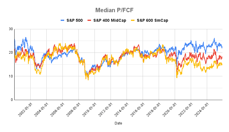
For instance, here’s the median P/E ratio for the S&P small, mid, and large cap indexes over time.

There’s no significant difference for all three between now and last year.
Here’s the same chart with the 10 largest S&P 500 companies separated out. (Note: the top 10 includes the Mag 7 and Berkshire Hathaway, Eli Lilly, and Broadcom, as of today.)

Obviously, P/E for the 10 largest stocks is elevated, but not as high as last year. P/E’s range from 16 (Berkshire) to 286 (Tesla). Meta is the next lowest at 28. And overall, not even close to the tail end of the Dotcom Bubble.
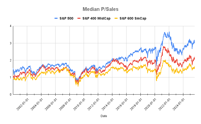
Here’s the same breakdown with P/Sales.
And with the top 10 companies pulled out.

P/Sales is notably higher for the 10 largest companies. The range is equally notable from 3 to 31. But again, not much difference from last year.
Finally, here’s P/FCF.
The same with the 10 largest companies.
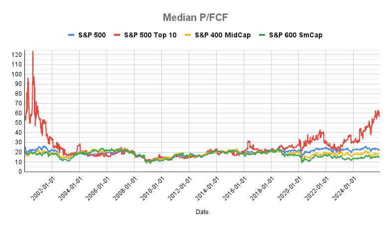
There’s no material difference between the three indexes from last year. However, the 10 biggest companies is a different story. It’s the highest it’s been in a long time but still not close to the Dotcom Bubble.
The simple explanation is that free cash flow (FCF) is money left over after covering the cost of operations. If companies increase capital expenditures (CAPEX), all else equal, then FCF falls. A lower FCF with a flat or rising stock price pushes the P/FCF higher.
Reports of increasing CAPEX spend by tech companies have been consistent throughout 2025. The trillion-dollar question is will it pay off? Will investors get a return on that investment based on the expectations priced into the stocks? I don’t have the answer. Tech bubbles always have a mix of fantasy and reality built into the story. Sometimes it’s tough to know which is which.
The good news is that markets were higher this year. More pockets of speculation may exist but broadly, U.S. markets are no more expensive than last year.
If you’re worried markets might be getting heady, rebalancing is always an option. Moving a portion of your portfolio from expensive to cheap assets classes or from what has done well in recent years to what hasn’t done well has generally worked out well in the long run. It also helps minimize regret for investors.
Related Reading: