As bull market enthusiasm wanes, stocks correct and overcorrect. The excess in stock prices burns off. Large-caps become mid-caps, mid-caps become small-caps, and valuations change. That change in valuation creates opportunities.
As you’ll see below, not all stocks in an index trade at the average valuation. But first, let’s start with how things have changed in the last 6 to 12 months.
Market Volatility Cooling
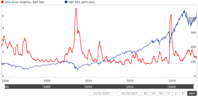
Market volatility is a decent substitute for investor fear or reluctance to own stocks since the biggest spikes appear near the largest market declines.
The chart also shows that often the best time to put money into the market is when it’s scariest. Waiting to invest in stocks until the market “calms down” or for a “better opportunity” often means missing the bounce off the market low.
Note that volatility peaked last December. It’s cooled off since then just as the market began rising off last year’s lows.
High-Flyers Are Down But Not Out
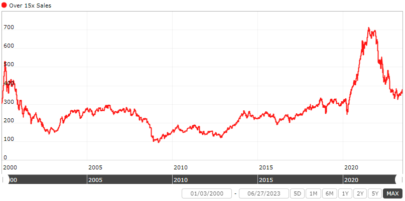
The last bull market saw a massive spike in the number of stocks trading over 15x sales. That number dropped by half in last year’s bear market. The excess has come off…somewhat. Except, it’s still high compared to the last 20 years.
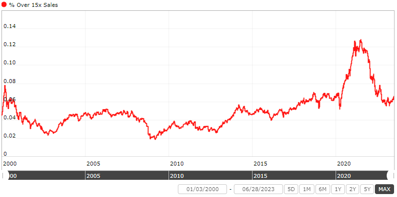
You see a similar picture viewed on a percentage basis. The willingness to pay ridiculous prices is apparent. Investors and gamblers alike who bought high flyers near the peak got burned as the market corrected. But it’s still above the average since 2000.
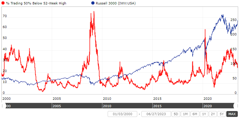
The aftermath of the bear market is seen in the percentage of stocks trading at least 50% below their 52-week high. About 40% of the universe of stocks (ex OTC) were down 50% or more from their highs last year. That number has come down thanks to time and/or rising prices. But it’s still generally high compared to the last 23 years.
Concentrated Performance?
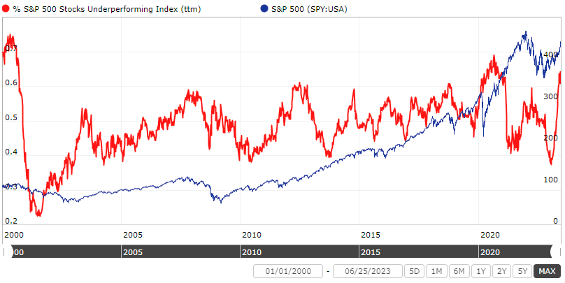
A big discussion this year is focused on how a handful of stocks are driving the S&P 500’s performance year to date. When looked at over the last 12 months, the number is also high but not nearly as high as in 2020 or right before the Dotcom bust. About 62% of the stocks in the S&P 500 have underperformed the index over the past 12 months. So 38% have outperformed.
More importantly, the only thing the chart shows is that the percentage of stocks underperforming/outperforming is not constant. Most of the time it swings around that 40% to 60% range over the last two decades. If anything the chart is an argument for diversification because you never know which stocks drive performance in any given year.
Market Valuation
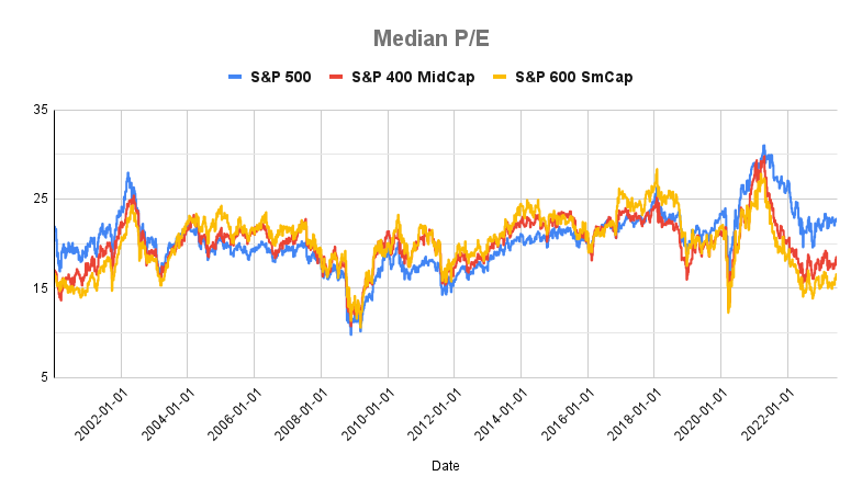
The average P/E for the S&P 400 (smallcap), 600 (midcap), and 500 (largecap) has been flat since the middle of last year. Large caps currently sit at a median P/E of 22.5. Small caps and mid caps are cheaper at a P/E of 15.9 and 17.6, respectively.
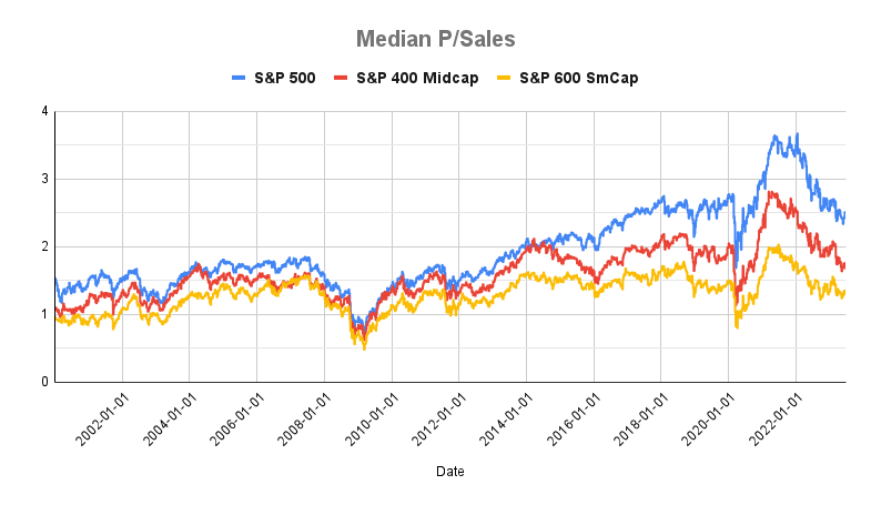
The median P/Sales of all three indexes continued to decline from last year. The S&P 500 trades at median P/Sales of 2.4. Again, small and mid-caps are lower at 1.3x and 1.7 times sales.
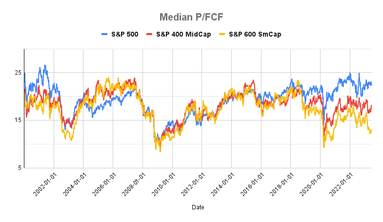
The drop on a free cash flow basis is less clear compared to P/E and P/Sales. Large caps trade at a median P/FCF of 22.4. Again, small and mid-caps are lower at 12.4x and 17.9x FCF.
But the cheapest decile is where things get interesting.
Cheapest Decile Valuation
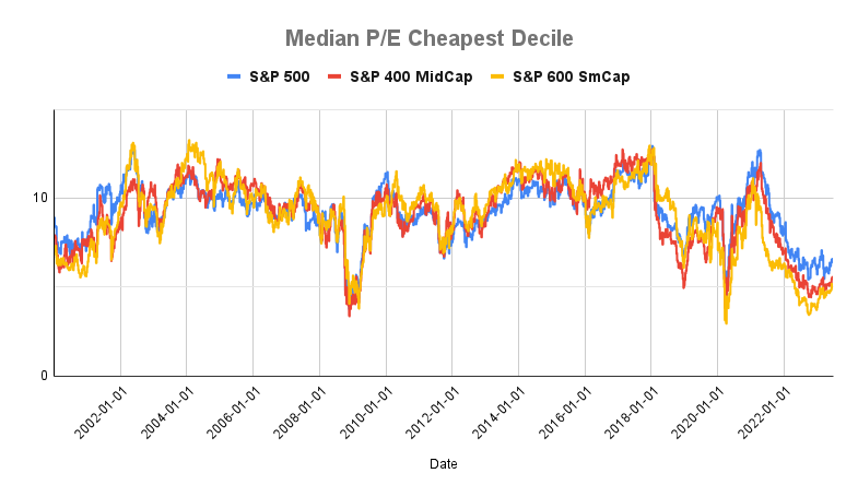
The median P/E of the cheapest 10% of stocks in the S&P 400, 500, and 600 trade at a significantly lower multiple than the average stock in the index. The cheapest decline, in all three indexes, trades in the range of 5.0x to 6.5x earnings compared to the median of 17.6x to 22.5x. And they trade at lows not seen since the 2020 pandemic crash and 2008 financial crisis.

A similar story plays out with the median P/Sales for the cheapest decline. The cheapest stocks in all three indexes trade at a fraction of the average P/Sales for the entire index. It ranges from an average of 0.2x sales for small caps to 0.4x sales for large caps.
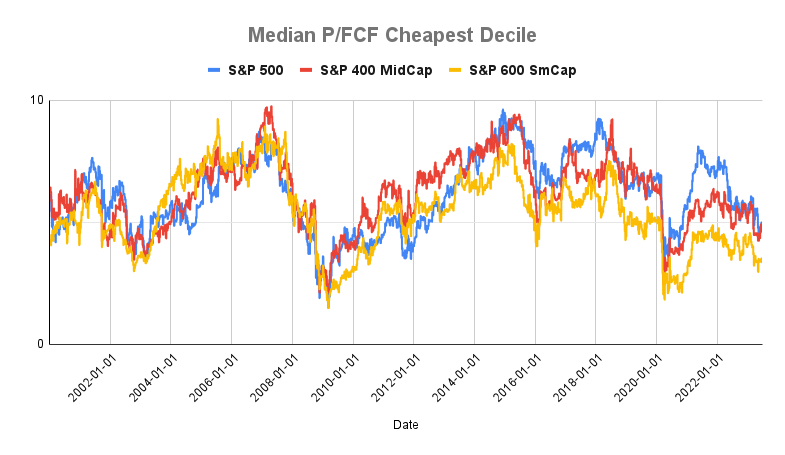
Again, the cheapest decile for each index trades at 5x or less free cash flow. That’s a fraction of the median P/FCF for each index, ranging from 3.3x to 4.9x free cash flow.
In all three metrics, the cheapest decile trade at a fraction of the index’s average. The next three charts show the ratio of the cheapest decile to the index and just how cheap the cheapest decile is today versus the last 23 years.
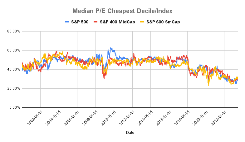

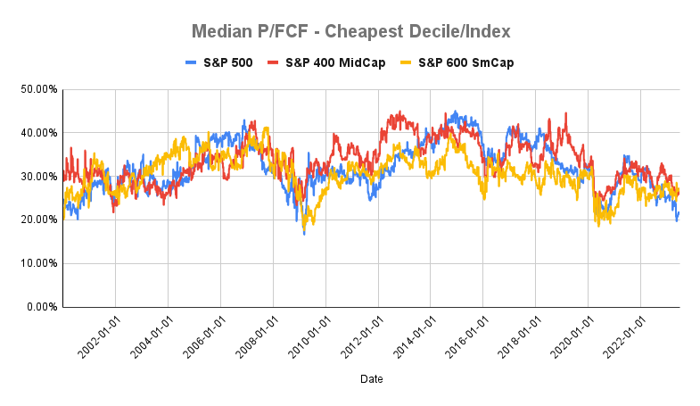
With the exception of P/Sales, the cheapest stocks are ridiculously cheap to the point of trading at or near 20-year lows. And as history has shown, the cheapest stocks tend to outperform their respective indices.
Related Reading:
The Benefit of a Bear Market in Everything
The Hidden Market Crash