The 2016 returns are in. The asset tables are updated.
I’ve explained this before here, here, here, and here, but I’ll do it again just in case. People use data to tell a story.
The simple story for these tables is diversification, allocation, and market cycles. It’s hard enough to pick the best performers every year, but even harder to do it while avoiding the worst ones, so we diversify across asset classes and geographies. When you take the good with the bad, you get a decent return over time. Decent may not be exciting or something to brag about at parties, but it gets the job done thanks to compounding. Really, that’s what you want. Exciting is for skydiving, not investing. Don’t get those confused.
As usual, I’ll point out a few things I see in each table along with some data that was left out. And click the images for the full-sized table.
Let’s get to it.

A lot can change in a short amount of time. Six months ago large caps, small caps, cash, and international stocks filled out the bottom of the table. Since then, large caps added about 9%, small caps added about 18%, international finished positive, and cash…is still pitiful.
It’s always interesting to see how fast and far some areas change while others don’t. Nobody I know was claiming small caps would top the year or that the S&P would jump 9% to end the year. Markets can go nowhere for years and then move quickly. They’re funny that way. It’s part of the head games that drive people to question every decision they make. This is why process is so important. Find a strategy that you can work with, build a process around it, and stick to it. Trust the process will produce results.
The process in the chart above – a basic buy, hold, and rebalance portfolio – earned about 7.5% annually over the past 15 years. It only had 3 losing years, 2008 being the worst.
Remember the world was ending in 2008? Here are some numbers for you:
| Asset | Returns 2008 – 2016 | Returns 2009 – 2016 |
| US Large Caps | 7.11% | 14.45% |
| US Small Caps | 8.07% | 14.89% |
| International Stocks | 0.13% | 7.45% |
| Emerging Markets | -1.32% | 8.31% |
| REITs | 7.67% | 15.30% |
| High Grade Bonds | 4.06% | 3.91% |
| High Yield Bonds | 8.33% | 13.69% |
| Cash | 0.25% | 0.11% |
| AA Portfolio | 5.06% | 9.11% |
The first column of returns includes the financial crisis the second column is what followed it.
The financial crisis scared a lot of people into quitting. And if that was the case, then high-grade bonds or cash were the most likely asset to turn to but at what cost? Gold was all the rage back then, owning that would have earned you about 3.5% annually (via GLD) but you would have had to deal with the sharp rise and fall that came with it. And sure, better allocations (than the one I randomly made up for the table) exist with better returns and the window I’m using is convenient, but the fact is none of it is possible by quitting after one really bad year.
Last point: Since 2008, U.S. stocks, REITs, and high yield bonds have outperformed, while international and emerging markets have lagged. That can’t last forever.

You might notice the S&P sectors now go to eleven. The financial sector was split in two – financials and real estate. S&P took some liberties with backtested real estate returns and only for the last 10 years (thus the shortened time frame).
The new real estate sector only makes up about 3% of the S&P 500’s total market cap. The real estate sector can have a great (or terrible) year but only have a minor impact on the S&P 500’s overall return. But when a larger sector has a bad year, it can drag down the overall results.
| Sector | 12/15 Weighting | 12/16 Weighting |
| IT | 20.7% | 20.8% |
| Financials | 16.5% | 14.8% |
| Health Care | 15.2% | 13.6% |
| Cons Discreationary | 12.9% | 12% |
| Industrials | 10.1% | 10.3% |
| Consumer Staples | 10.1% | 9.4% |
| Energy | 6.5% | 7.6% |
| Utilities | 3.0% | 3.2% |
| Materials | 2.8% | 2.9% |
| Telecoms | 2.4% | 2.7% |
| Real Estate | – | 2.7% |
Beyond that, the last six months of 2016 gave a big boost to several sectors: financials added 26%, IT added 14%, industrials added 12%, and energy added 11%. You’d think the S&P 500 would be up more. It makes sense once you consider the weightings above and the S&P added about 8% over the same period.
Energy is still the cheapest sector (based on P/E) of the bunch even after its great performance last year.

Each year I write this section I think I repeat myself. Collectively, international stocks are cheap and still disappoint. They haven’t done much since 2008. Fingers crossed something changes soon before I just cut and paste.
The international table shows 12 of the 22 largest developed markets ex. U.S. based on MSCI’s definition of “developed”. Canada, New Zealand, Norway, Austria, and Australia saw double-digit gains. Israel (-24%) and Denmark (-15%) were the biggest losers, followed by Italy.
The lack of change isn’t lost on valuations either. Portugal, Italy, Spain, Singapore, and Norway are still the cheapest with a CAPE of 11 or less. Though, I believe Austria and Singapore swapped spots in the past six months (Austria is sixth cheapest with a CAPE of 13).
Denmark, Ireland, Belgium, New Zealand, and Japan still sit at the expensive end of the CAPE leaderboard with a 22 or higher. The U.S would be 3rd expensive on that list.
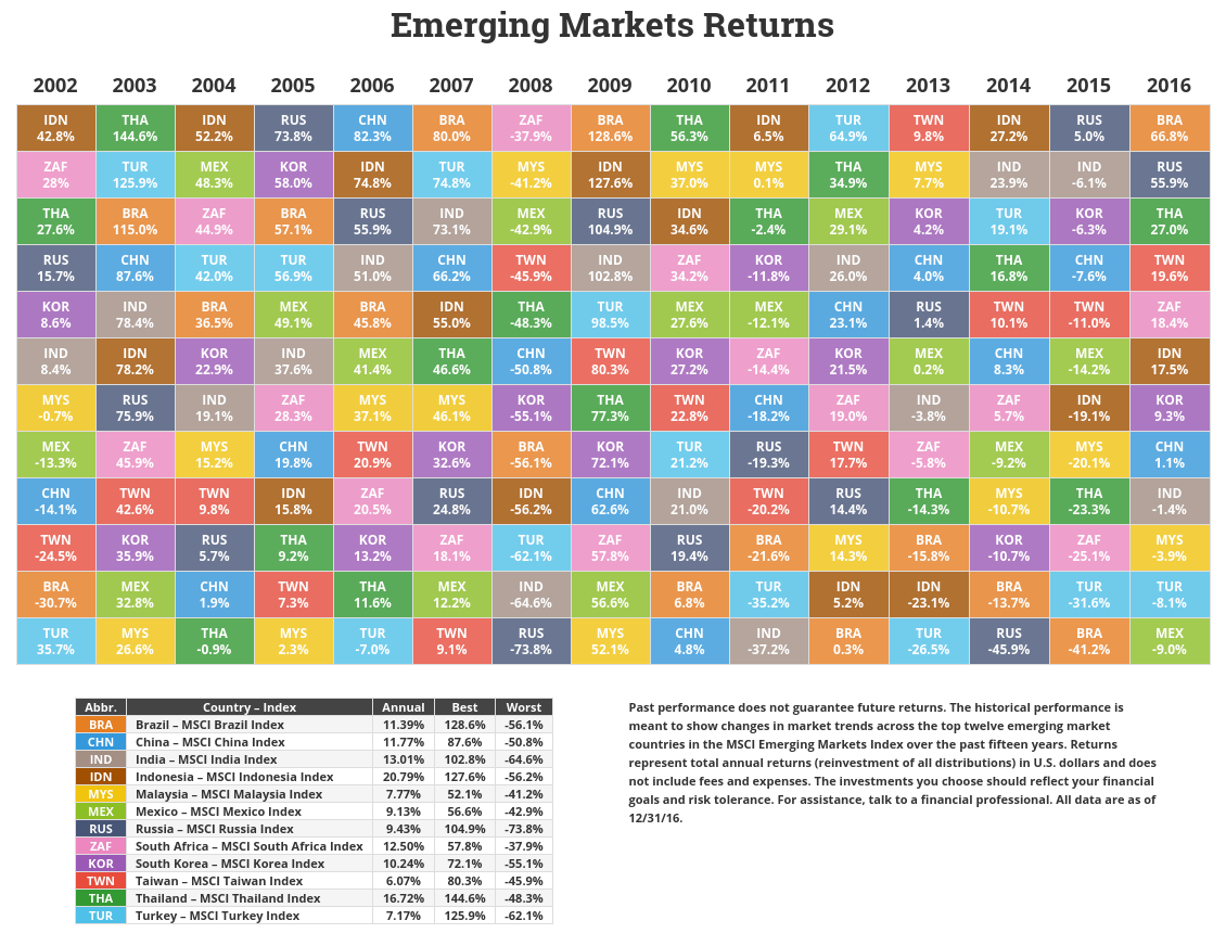
The emerging markets table show 12 of the 23 largest emerging markets based on MSCI’s definition of “emerging”. Collectively, EM stocks rose 11.6% in 2016. Individually, there were a few standouts. Brazil and Russia led the way followed by a few not shown: Peru at 55%, Hungary at 35%, and Colombia at 26%. Worst performers were Greece and Egypt with an 11% loss each.
I briefly covered Brazil and Russia at the 2016 half way point and it’s worth repeating. Buying unloved markets pays off…eventually. You just have to be able to stomach waiting. A 41% drawdown isn’t the easiest thing to stomach either. But as part of a broader strategy, those drawdowns can be tempered and the waiting gets easier.
And both are still considered cheap despite their great performance last year. Brazil sits with a CAPE of 9 and Russia at 5! Greece, Czech Republic, Poland, and Turkey are the only other three with a CAPE below 10. On the expensive end you have the Philippines, Mexico, Indonesia, India, and Taiwan with a CAPE of 19 or higher.
Overall, emerging markets are still cheap compared to developed countries.