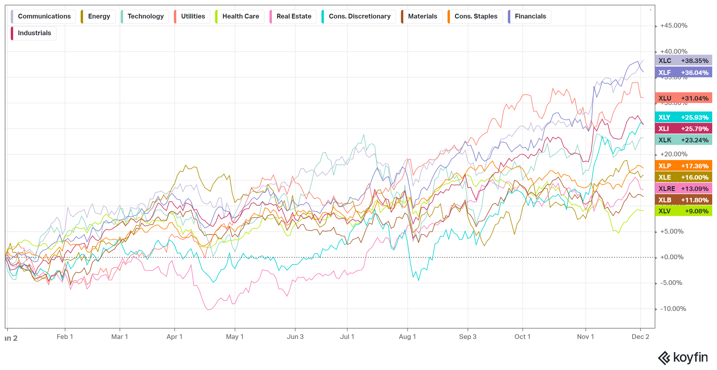
The story of 2024 began with worries about market concentration in the Magnificent Seven only to have the least techy sectors stand out by year’s end.
Both the S&P 500 and Nasdaq are up close to 26% year to date. Including dividends adds a couple of percentage points to that. It’s been a phenomenal year for U.S. stocks.
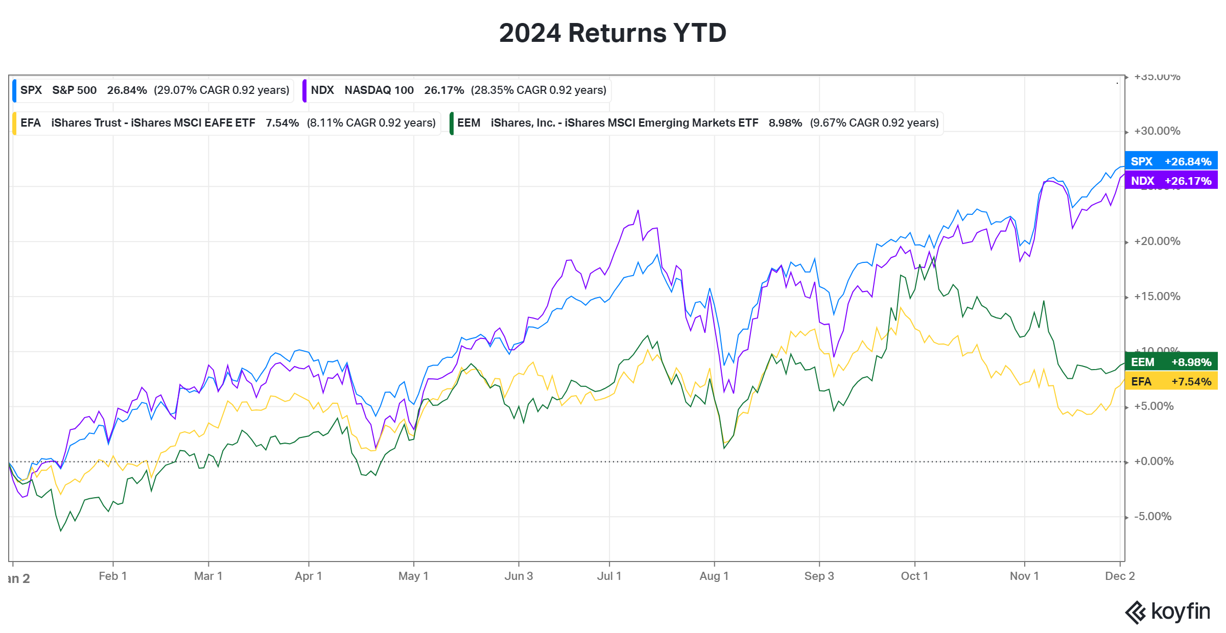
International (EFA) and emerging markets (EEM) fell short of the US. Both started the year well — exceeding double-digit returns through September. Then came the dip. The disconnect in performance between US and international stocks is ongoing for over a decade. In fact, since 2009 (to 2023) the S&P 500’s total return is almost twice that of the MSCI’s international and emerging market indexes. These things tend to move in cycles, so it will be interesting to see how much longer it continues.
As mentioned at the top, a few unlikely sectors top the performance chart for 2024. Communications is not one of those but it’s the best performer year to date. The next four were surprises — Financials, Utilities, Consumer Discretionary, and Industrials all outperformed Tech. Markets are full of surprises.
The worries about a market concentration at the beginning of the year might have been overblown. It’s true that early in the year, very few companies in the S&P 500 were outperforming the index. That changed about midway through the year. To date, around 40% of the 500 companies in the S&P 500 have outperformed the index.

Two things should stand out in the chart above. First, the percentage of stocks in the S&P 500, that outperform it, is never static. The biggest swings seem to appear during big market events. Second, that number is irregularly low in the past two years compared to the last decade.
The scatter plot below is another way to look at the performance of S&P 500 companies. The Magnificent Seven stands out – the seven companies on the right side of the chart.
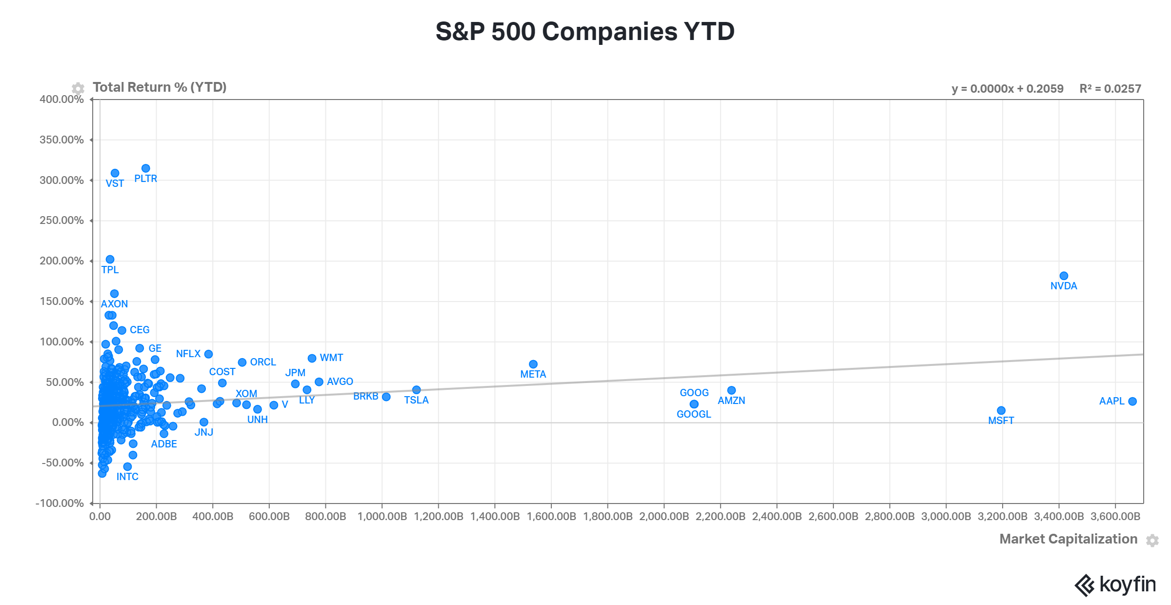
Because the S&P 500 is a market cap-weighted index, the bigger the company, the bigger the impact its returns have on the index. When the largest companies in the world account for roughly 34% of the index, it’s no wonder there might be concerns going forward. This year is a good example of why the other 493 companies still matter. That cluster on the left of the chart, when added up, can still impact the index.
I shared the next chart before. It shows the average 3-month volatility for stocks in the S&P 500. It’s a perfect image of what investors deal with over time — long periods of calm interrupted by moments of chaos. The biggest spikes occur during the harshest market crashes.
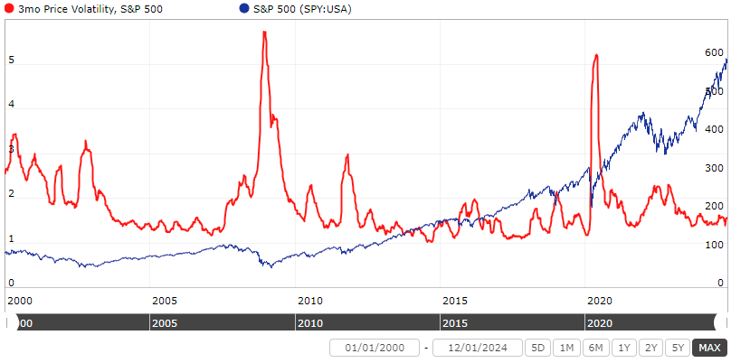
The calmer periods, like what we’ve experienced the past two years, occur during bull markets. One of the downsides of bull markets is the potential for complacency and taking on more risk because stocks appear to be less risky. The lessons are learned when the market reminds us about those risks when we least expect it. The calm is nice but it’s temporary.
One of those risks that has been argued about for over a decade is market valuation. The next three charts show the median valuation for U.S. large-cap (S&P 500), mid-cap (S&P 400), and small-cap stocks (S&P 600).
The first shows median Price/Earnings for the trailing twelve months (ttm).
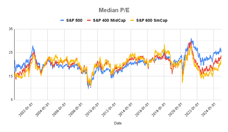
The current market valuation based on median Price/Earnings (ttm), while high, is not as high as the speculative period of 2021. Multiples for small caps are cheap relative to mid-caps, and mid-caps are cheap relative to large caps.
Median Price/Free Cash Flow (ttm) is next.

Price/Sales (ttm) shows a similar picture to median P/E.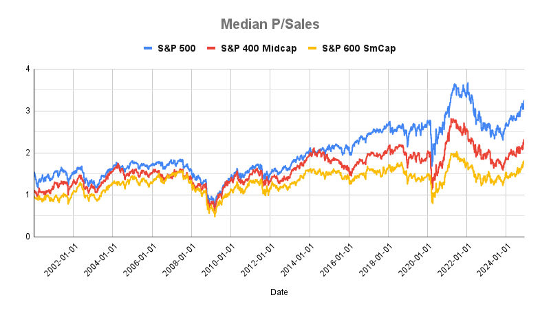
What stands out in all three valuation charts is how the range in multiples across small, mid, and large caps has grown wider over the last few years. A willingness to pay more for rising profit margins over the last 20 years might explain part of it (lower interest rates might explain some it too). How much of that disconnect is due to an embedded expectation of higher quality? Is it warranted?
I’ll leave that open-ended and jump to the next impossible question. Are valuations excessive? We know what the research says. Cheaper multiples present buying opportunities and a chance for better returns. Higher multiples tend to be followed by lower returns. But what is considered low and high these days?
But the experts have warned about high valuations for over a decade. Acting on those “warnings” would have kept investors out of one of the best U.S. bull markets for years.
The good news for investors is that large-cap stocks are not the only game in town. If you’re worried about large caps being too expensive you have options. U.S. small-cap and mid-cap stocks fit the bill. The same is true for international and emerging market stocks. Even if you’re not worried those other options are worth considering too.
Diversification still matters. If market history has taught us anything is that diversification matters most when the consensus believes it matters not. Its benefits pay off when we least expect it.
Related Reading:
Chasing Away the Market Worries of 2023
The Benefit of a Bear Market in Everything